Hand Lettering
|
Hand Lettered wall Art, Pennants, Poster, and a Sweater Design


Reason for the creation, and the process.

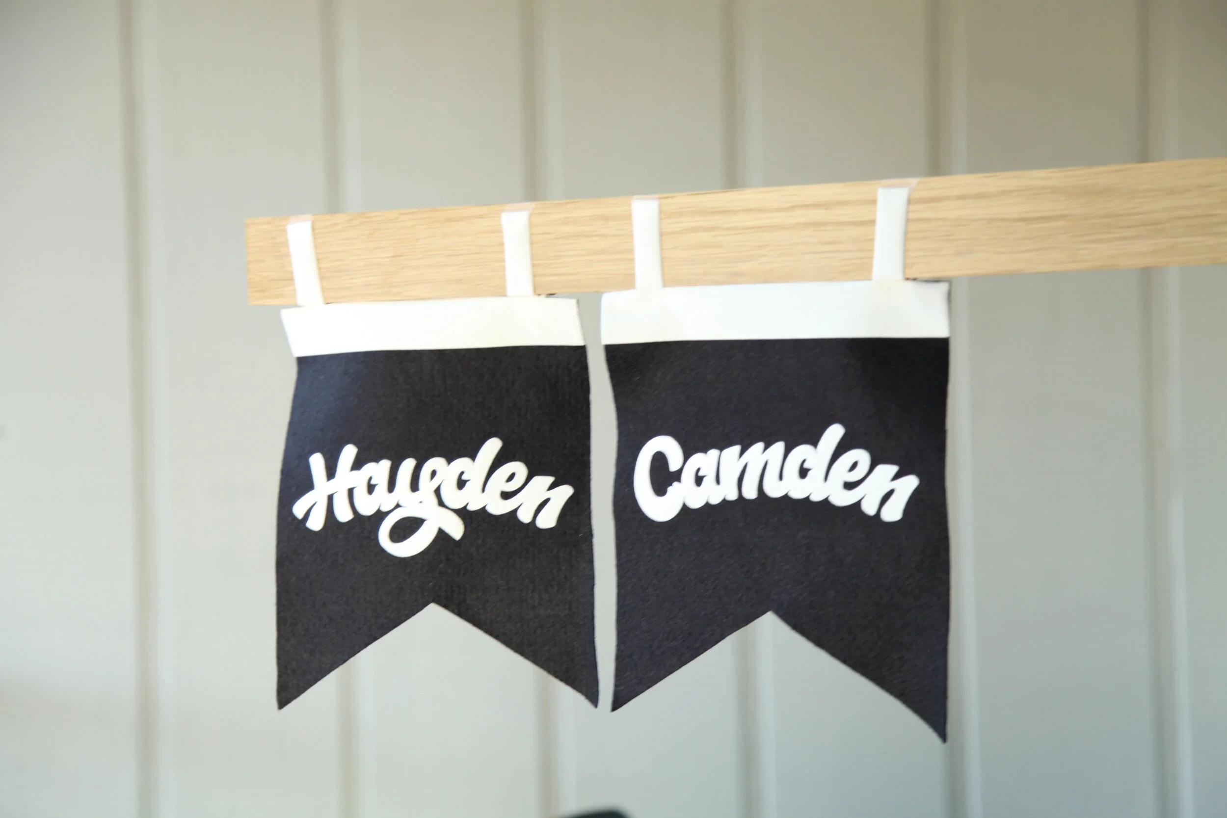
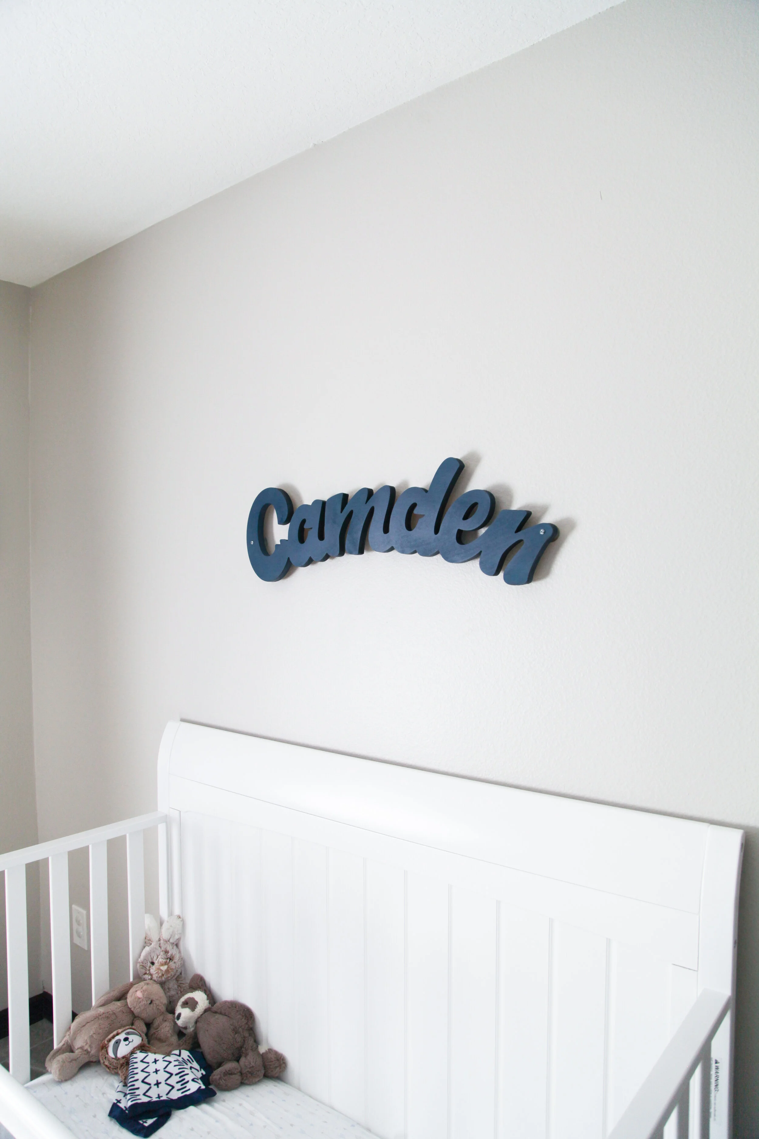
This was a personal project, it was actually a gift to my sister and brother in law for their newborn's nursery wall/door. I always try and jump on opportunities to help out my family/close friends by using my creative skills/craft.
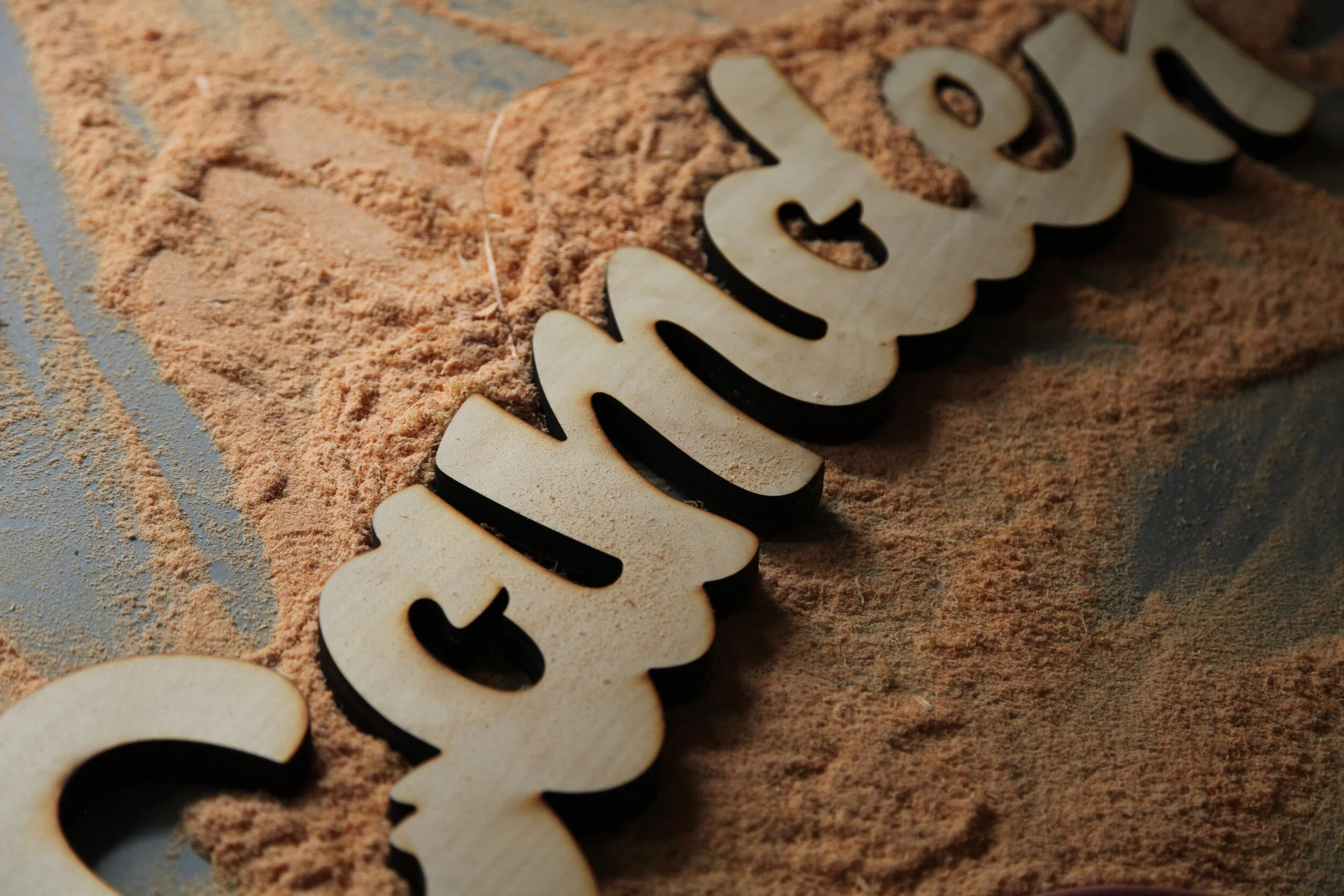
I hand-lettered a cursive word for two reasons. For one, it’s easier to hang up one solid piece instead of hanging each word separately. The other reason was that my turn around time was short and this was a quicker process. Before I started this project I knew I wanted to make this unique and original. So because of that, I started on my iPad. By sketching out different proofs, I found that I was inspired by the look that the brush pen gave. It comes off as a kid, friendly, yet professional aesthetic. After I was happy with the sketch I sent the design to illustrator to make it vector and clean it up. Then off to the laser cutter I go, cutting the shape out. This laser cutter only cuts quarter inch thick wood, so I cut it out three times and glued them together to get the thickness I wanted. From there the sign was painted and hung.


This was yet another personal project, I made this for my Home county of 321. I’ve spent most of my life there and it’s made a big part of who I am today. So I made this in dedication to my roots, count down county 321.
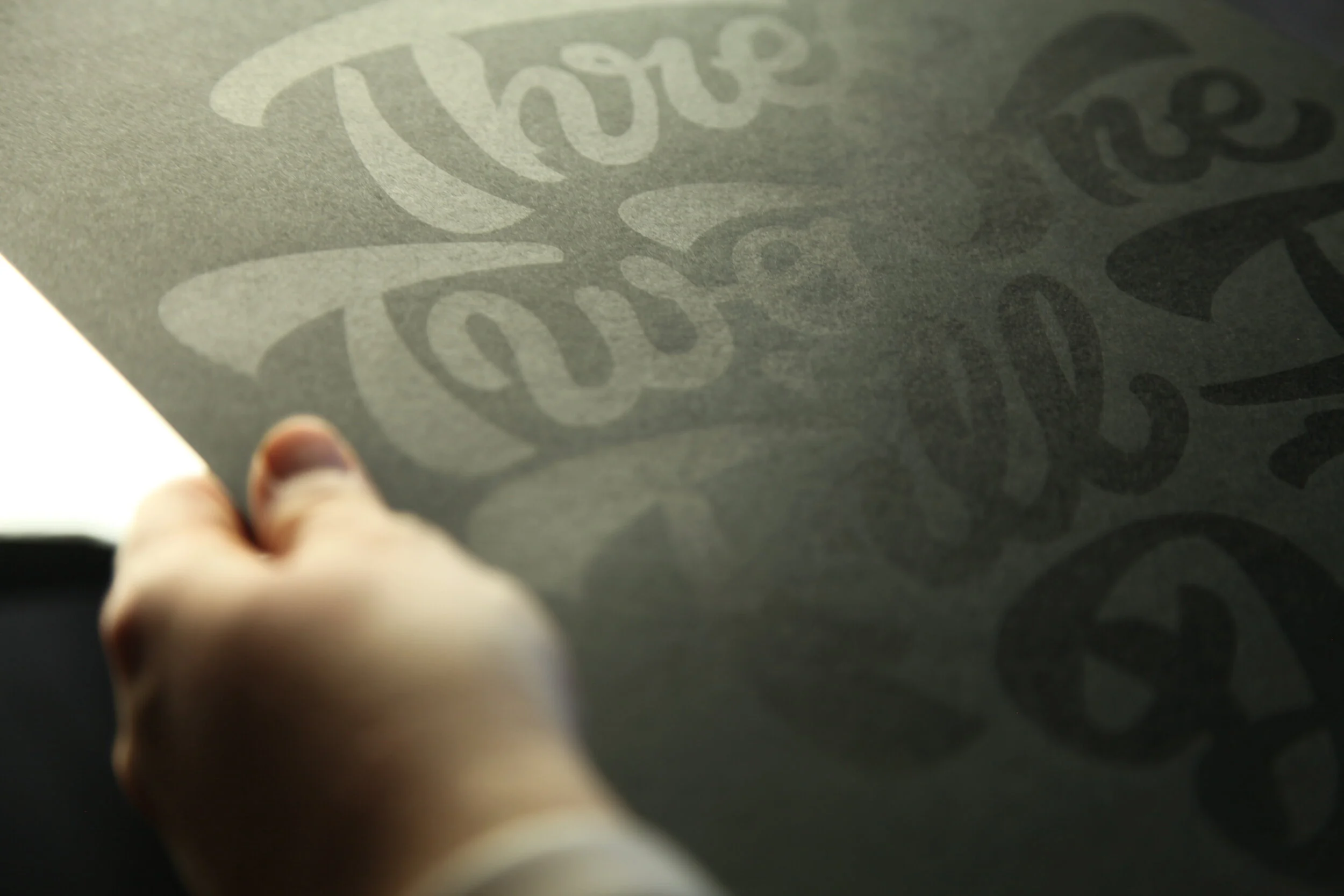
I made a preliminary sketch of the design on my iPad and vectorized it. From there I screen printed it. I wanted the letters to blend into the paper, but show up with the reflection of light. So to do this I ordered a black matte paper. Because the acrylic paint we used is already shinnied the matte paper is the perfect amount of contrast from ink to paper. I’m very happy with the result.


This design was to promote the UCF organization “Late Knights.” It was a project I completed for work. The goal was to make a sweater design that gives off a friendly aesthetic, and that shows off when the organization was established.


Final version

Sweater Mockup